Turn your spreadsheet into a publication-quality map.

Five Python scripts that take a plain CSV and produce a figure you'd be happy to put in a report. No ArcGIS. No QGIS. No GIS degree.

Get the pack — $19 See what's inside One-time. Yours forever.
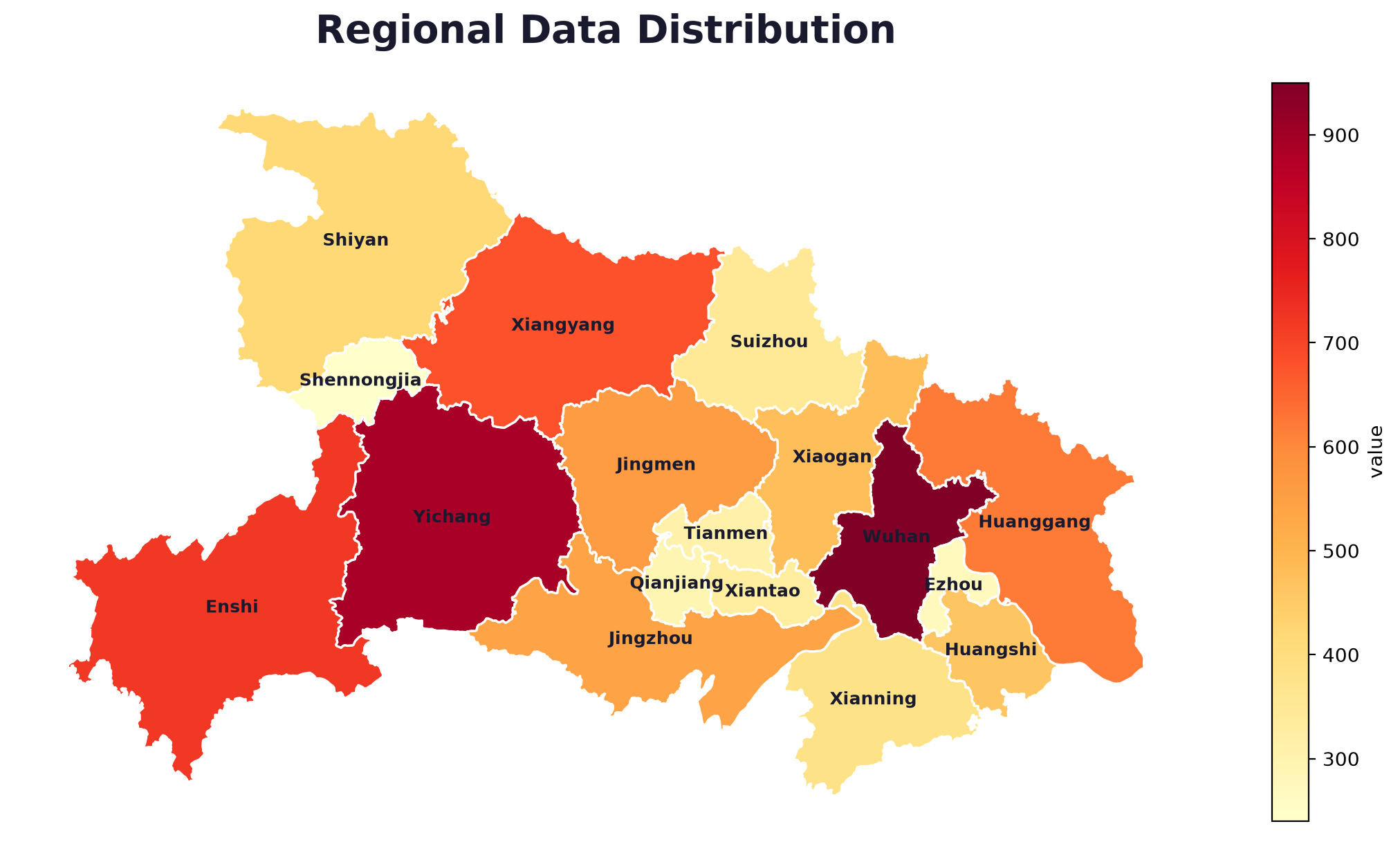
Choropleth map generated by the template

What's inside

Five scripts. Five kinds of map.

Each one is a single self-contained file with a configuration block at the top. Change the paths and the title, run it, get your figure.

Choropleth map

Choropleth map

Shaded regions from your data — one row per region. The classic "map by numbers" look.

01_choropleth_map.py
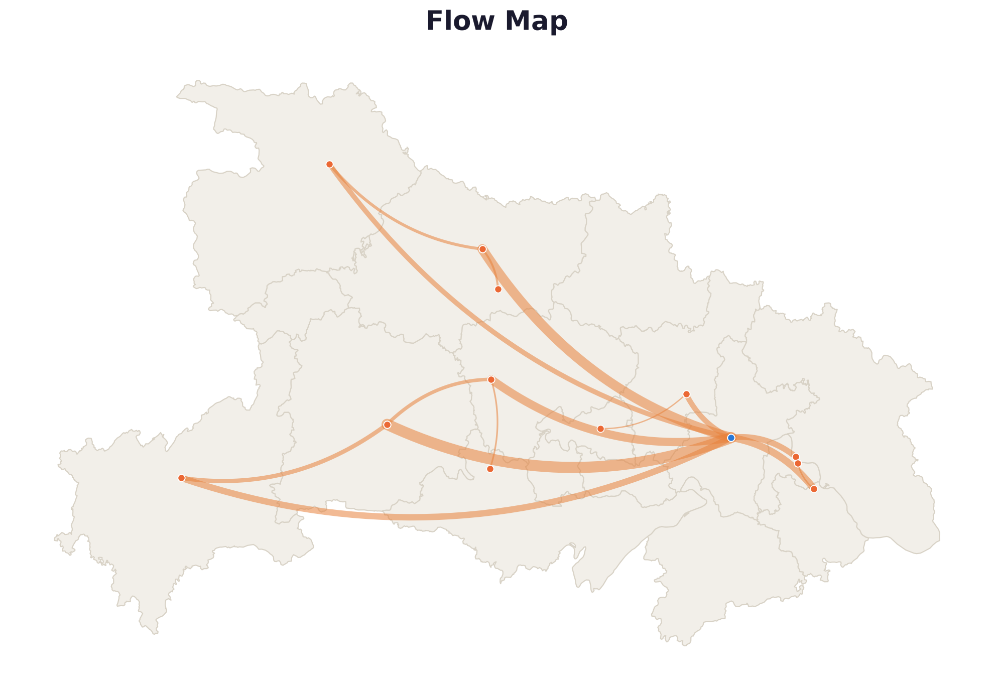
Flow map

Flow map

Curved origin→destination lines with width proportional to volume. Migration, shipping, commuting, trade.

05_flow_map.py
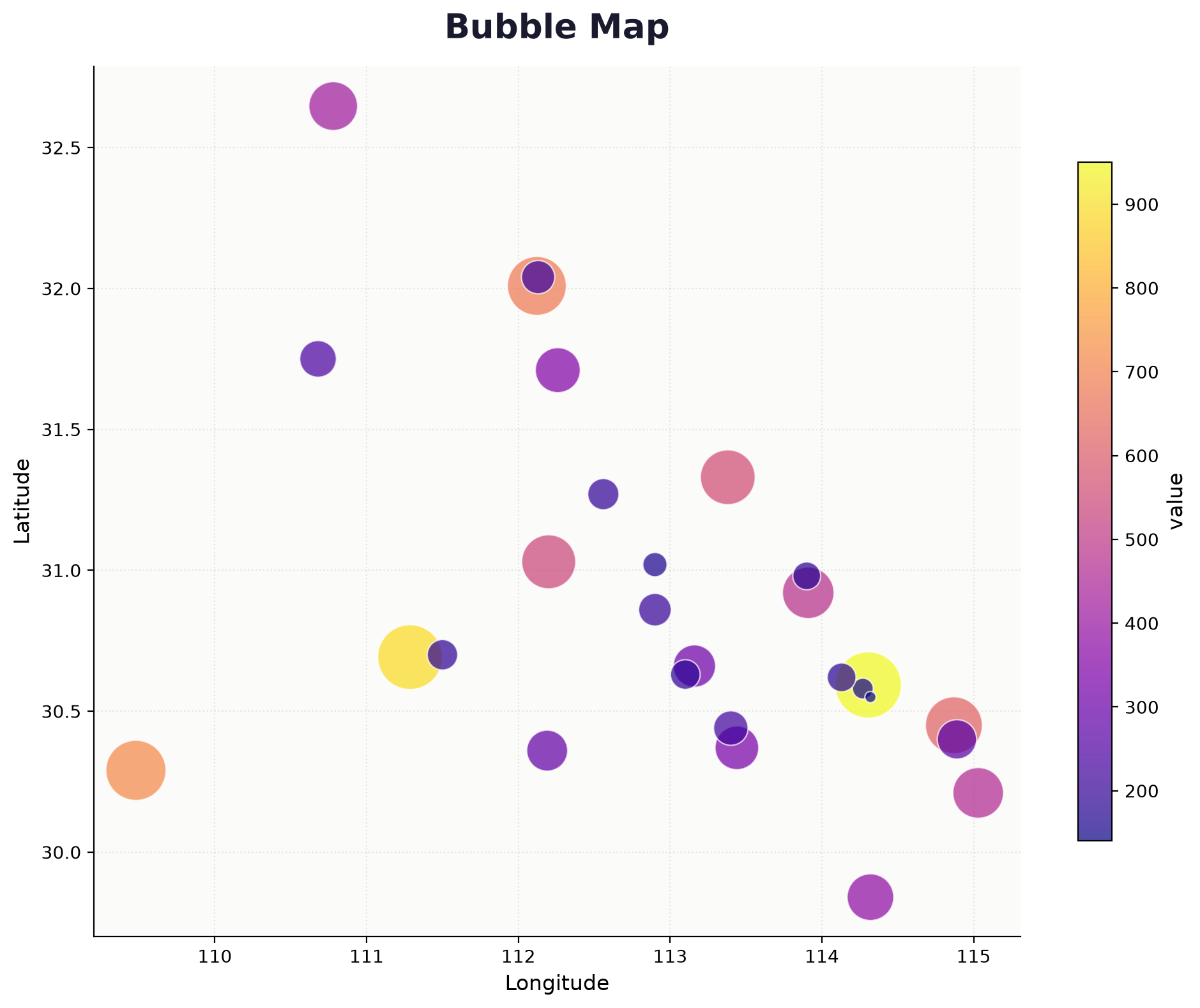
Bubble map

Bubble map

Dot size and colour both encode a value. Good when one number isn't enough to tell the story.

04_bubble_map.py
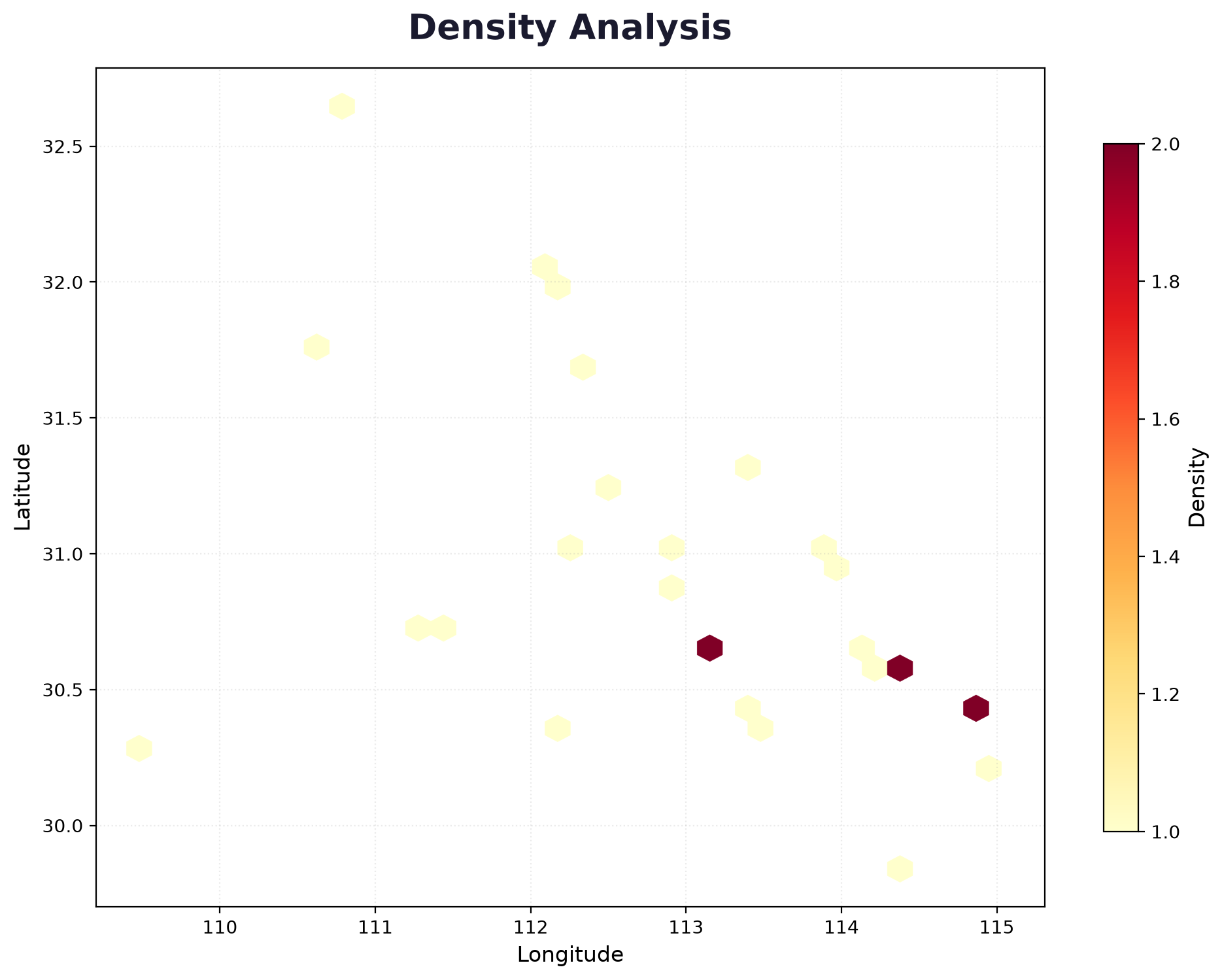
Density heatmap

Density heatmap

Hexbin aggregation that shows where points cluster. For customer concentration, incidents, traffic.

03_heatmap.py
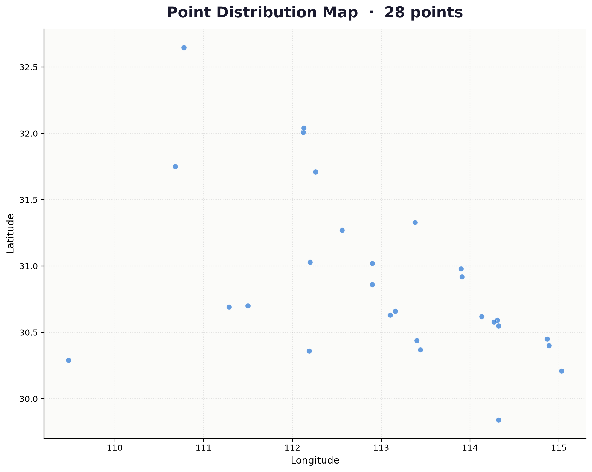
POI distribution map

POI distribution map

Plot points on a coordinate grid, optionally colour-coded by category.

02_poi_map.py

+ everything you need to run them

Working sample data for every script, a boundary GeoJSON example, a requirements file, and full setup notes with troubleshooting.

sample_data/ · requirements.txt · README.md

How it works

Three commands, roughly.

# 1. install the dependencies pip install -r requirements.txt # 2. edit the CONFIGURATION block at the top of a script # (file paths, title, colours — that's it) # 3. run it python 01_choropleth_map.py # → ../output/choropleth_map.png

Every script ships with sample data, so you can run it before touching your own — that way you know your setup works first.

Why it's worth it

What you're actually buying: an afternoon.

Writing a clean choropleth from scratch — proper projection, readable labels, a colour scale that doesn't look broken, a legend that isn't cut off — takes most people a full evening of fighting matplotlib.

These are the versions you'd end up with after that evening. Except they're already written, commented, and tested. If this saves you one afternoon, it's paid for itself.

Pricing

One price. No subscription.

$19 once

Download the pack, use it forever.

  • 5 mapping scripts, fully commented
  • Working sample data for each one
  • Boundary GeoJSON example
  • Setup guide + troubleshooting notes
  • Licensed for personal and commercial use
  • Free updates to this pack
Get the pack — $19

Questions

Before you buy

Do I need to know GIS?

No. If you can edit a few lines of Python and point a script at a CSV, you're set.

Do I need a GIS licence?

No. Everything runs on free, open-source Python libraries — pandas, matplotlib and geopandas.

What if my data is in Excel?

Save it as CSV first. The scripts read CSV; the README explains the exact column format each one expects.

Can I use the maps commercially?

Yes — in reports, papers, client work, presentations. The only thing you can't do is resell the templates themselves as a product.

My region names are in Chinese / Japanese and render as boxes.

That's a font setting, not a bug — the README has the two lines of code that fix it.

What if I get stuck?

Email me. I'd rather help you get your map made than have you stuck with a pack you can't use.